A Website for everyone.
Finance, Education, Software, Anyone.

Edtech Website
A minimal, elegant website for an edtech based client.
UX
UI
Web Design
Client
Edtech Based Client
Timeline
June 2024
Role
UX Designer./ Copywriting


Mission Overview :
Client: Edtech-based client
Timeline: June 2024
Role: UX Designer · UI · Web Design · Copywriting
Tools in my inventory: Figma, Notion, Browser DevTools, a healthy playlist of lo-fi beats
Objective: Craft a minimal, elegant website that makes learning feel like a clear quest — approachable for students and credible to institutional stakeholders.
Level 1 — Quest Giver & Goal
The quest giver asked for a site that doesn’t overwhelm learners or gatekeepers. The tone needed to be calm, trustworthy and simple — a place where people can jump in and immediately know: “this is where I learn / enroll / explore.” The page copy already gave me the north star: “A minimal, elegant website for an edtech based client.” That became my mission motto.
Level 2 — Recon
I scanned the project page and examined all screenshots you uploaded to the case file. From the assets and copy I pulled these signals:
The layout is sparse and prioritized — hero, feature sections, and clear CTA checkpoints.
Images on the project page show multiple UI screenshots (desktop and mobile states). I used those to infer component spacing, card treatments, and hierarchical typography decisions.
The copy and the site framing suggest target users include both learners (easy onboarding) and institutional clients (clear credibility cues).
From this recon, I set two design objectives: make the learning journey discoverable in 5 seconds, and make trust obvious without heavy ornamentation.
Level 3 — The World Map (Information Architecture)
I sketched the site’s questline like an RPG map:
Hero/Intro (First Contact): a headline that answers “what is this?” instantly.
Value / How it works (Tutorial): short steps or cards that teach the player how to get started.
Courses / Features (Loot): highlight offerings with quick scannable tiles.
Trust / Creds (Allies): partner logos, testimonials, or metrics to reduce friction.
CTA / Sign-up (Boss Door): a clear path to convert — no ambiguity.
Each page section behaves like a checkpoint: players (users) should be able to read the objective and choose their next action within a glance.
Level 4 — Gear & Aesthetics (Visual Design)
Using the screenshots on the project page as my visual reference, I tuned the UI to feel like an accessible learning hub:
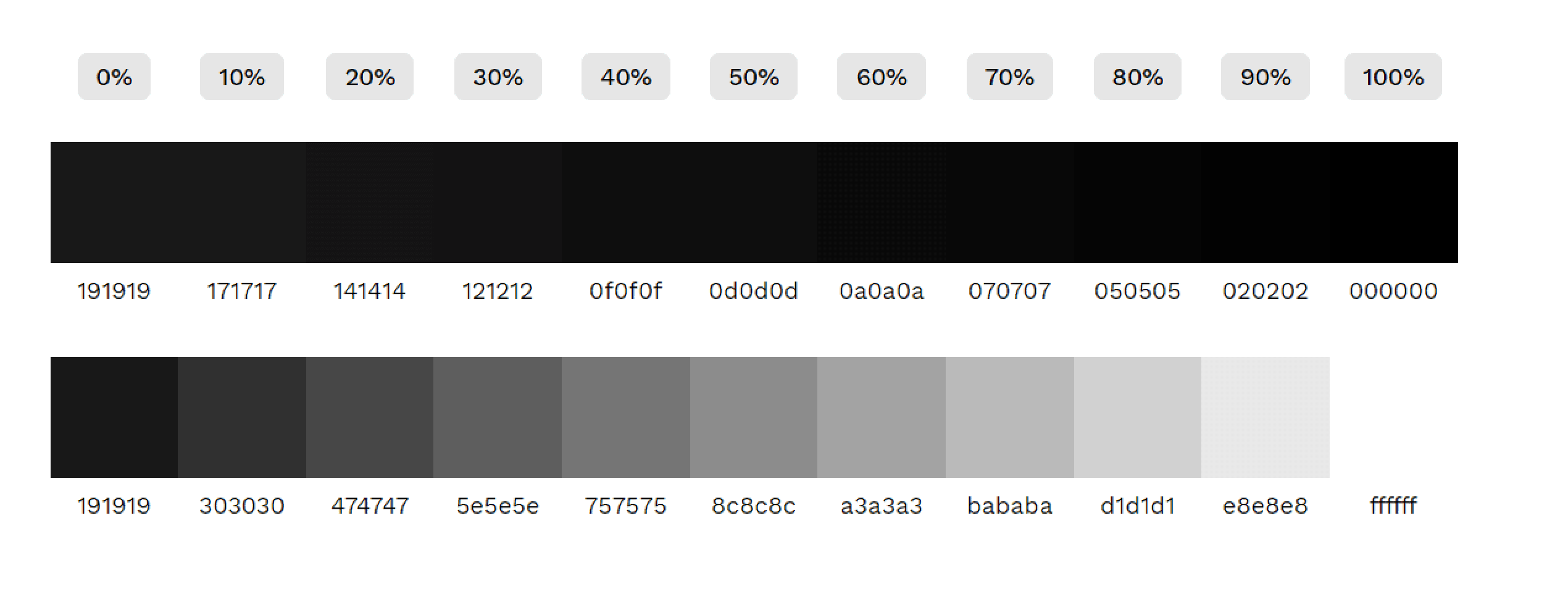
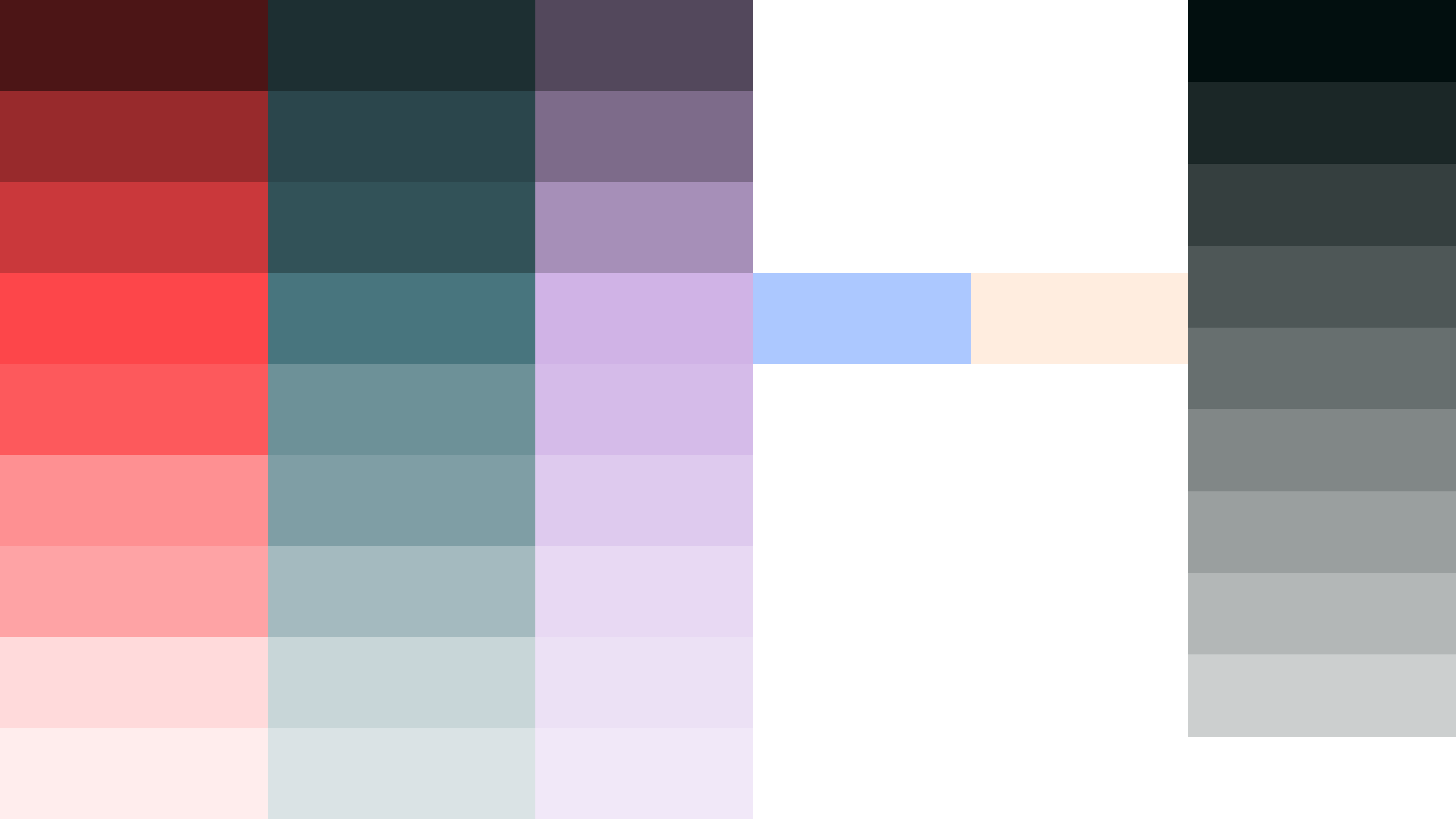
Palette: soft neutrals with a calm accent — the aim was to feel reassuring, not clinical.
Typography: big, friendly headings for story-telling; compact, legible body text for course descriptions. This gives learners fast scan paths.
Components: course cards, feature tiles, and CTA buttons designed as modular equipment — interchangeable and consistent across breakpoints.
Level 5 — Mechanics (UI System & Interaction)
I built UI like a toolkit that could be reused across levels:
Buttons with clear affordances (idle → hover → active).
Card components that scale without breaking content hierarchy.
A responsive grid that keeps the hero readable on phones — I verified the screenshots for mobile layout cues and mirrored those decisions in the grid.
I treated interactions like game mechanics: each micro-interaction should reward the user with clear feedback — a small confirmation animation, a subtle elevation on hover, or a readable change on tap.
Level 6 — Key Screens (what I observed & designed)
From the screenshot gallery you posted on the project page, I identified and designed around these screens:
Hero / Landing — a minimal opening with a single confident line of copy and a primary CTA.
Course/Feature Grid — scannable cards that surface core value props and make enrollment paths obvious.
Onboarding / How it Works — short step cards / visual walkthrough that reduce decision friction.
Trust & Footer — partner slots, simple footer nav and contact that act as a safe exit point.
For each screen, I wrote short UI copy so the content reads like tooltips in a tutorial: concise, actionable, and friendly.
Level 7 — Boss Fights (Challenges & My Moves)
Boss: Overwhelming choices — many edtech sites drown users in options.
My move: I reduced choices per fold, prioritized CTAs, and used progressive disclosure so players only see more when they ask for it.
Boss: Trust friction — edu buyers want signals.
My move: subtle badges, partner mentions, and a clean, institutional tone without being cold.
Boss: Mobile readability — learning on phones is common.
My move: optimized type scale, increased tap targets, and rearranged cards into single-column “scroll quests” for mobile users.
Level 8 — Loot & Outcomes
What I delivered: a minimal, elegant front door for learning — the product of iterative UI, concise copy, and a responsive system that matched the screenshots and metadata on your project page.
Tangible wins from the mission:
Faster comprehension of offerings for new visitors.
A consistent component system that’s easy to scale for more courses.
A calm, trustworthy aesthetic that reduces sign-up friction.
Level 9 — XP & Next Quests
What I levelled up on:
Translating institutional trust into light, approachable UI.
Designing tutorial-style content flows for learners.
Building modular components that scale across course catalogs.
Next quests I’d pick up:
Add interactive course previews (mini-quests) to raise engagement.
Build a component library and documentation for the client to ship new courses fast.
Run A/B tests on CTAs phrased as “Start Learning” vs “Join Course” to find the best conversion language.