A Website for everyone.
Finance, Education, Software, Anyone.
App Website
A functional, stylish interface and website for an authenticator software
UX
UI
Web Design
Client
Software Based Client
Timeline
June 2024
Role
UX Designer./ Copywriting
Mission Overview :
Quest name: App Website — Authenticator
Client: Software-based client (authenticator product).
Role: UX Designer · UI · Web Design · Copywriter.
Timeline: June 2024.
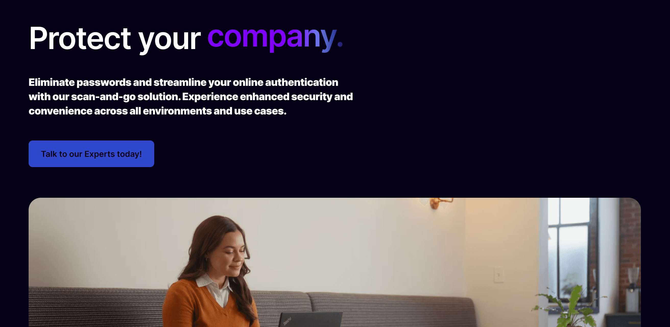
Objective: Ship a functional, stylish interface and marketing website for an authenticator app — make security feel approachable, quick to understand, and confidently designed.
Level 1 — Quest Giver & Core Objective
The client wanted a crisp front door for an authenticator product: a site that communicates trust and security without bogging visitors down in jargon. The game objective was to transform a complex security product into a readable, trustworthy questline — so players (users) can immediately see why they should onboard and how to begin.
Level 2 — Recon
I combed the project page and the screenshots you uploaded to gather intel. From the page I confirmed:
The project is explicitly an authenticator software website — security is the core domain.
The deliverable emphasises both function and style — the page title calls out a “functional, stylish interface and website.”
Multiple screenshots (desktop + mobile) are present on the project page; I used them to infer layout, component spacing, and hierarchy.
From this reconnaissance I set primary design goals: clarity of purpose, strong trust signals, and frictionless sign-up flows.
Level 3 — The World Map (Information Architecture)
I designed the site like a tutorial level that users can breeze through:
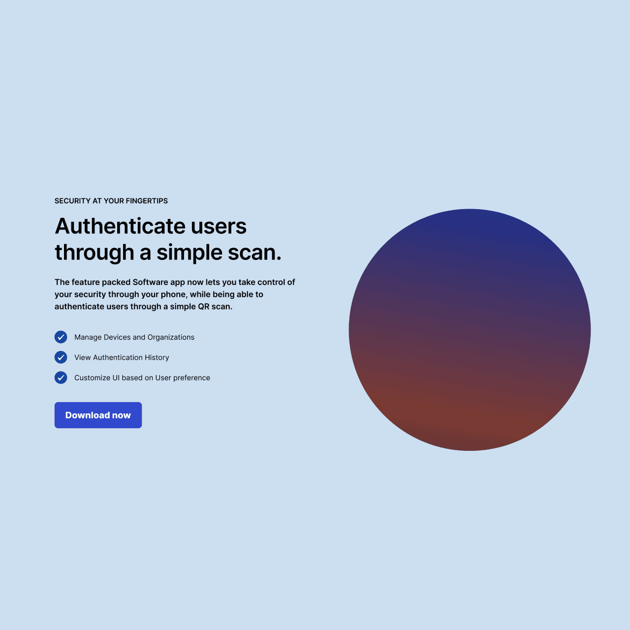
Hero — First Contact: Short headline that answers “what is this?” in a heartbeat.
How it Works — Tutorial Steps: 3–4 quick steps showing setup and daily use.
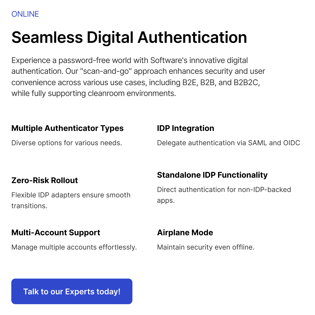
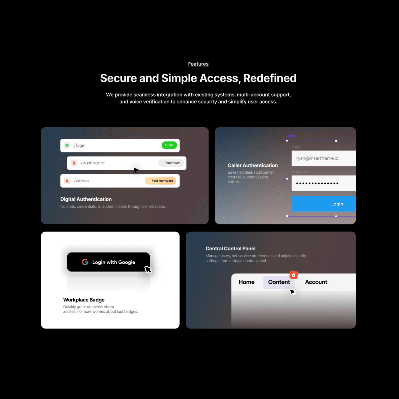
Features — Toolkit: Sync, device pairing, recovery, enterprise integration (scannable cards).
Trust & Security — Armor Room: Certificates, compliance badges, or partner logos.
Primary CTA — Get Protected: Clear path to install or sign up.
Each section is a checkpoint that reduces cognitive load and nudges players forward.
Level 4 — Visual Design & Tone
Based on the screenshots and the “functional, stylish” brief, I tuned the UI to communicate security without intimidation:
Tone: Calm, confident, professional — security that doesn’t feel scary.
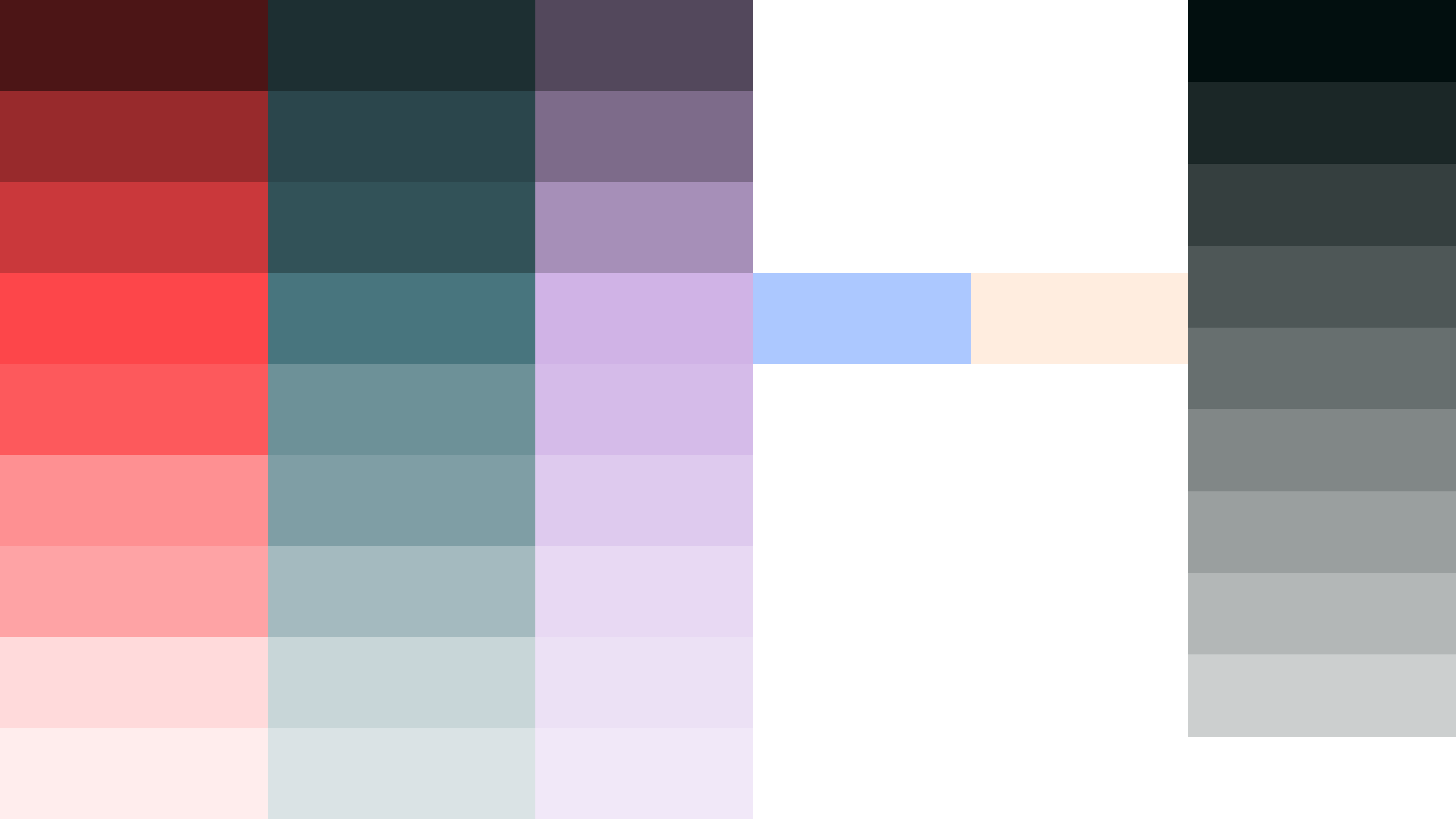
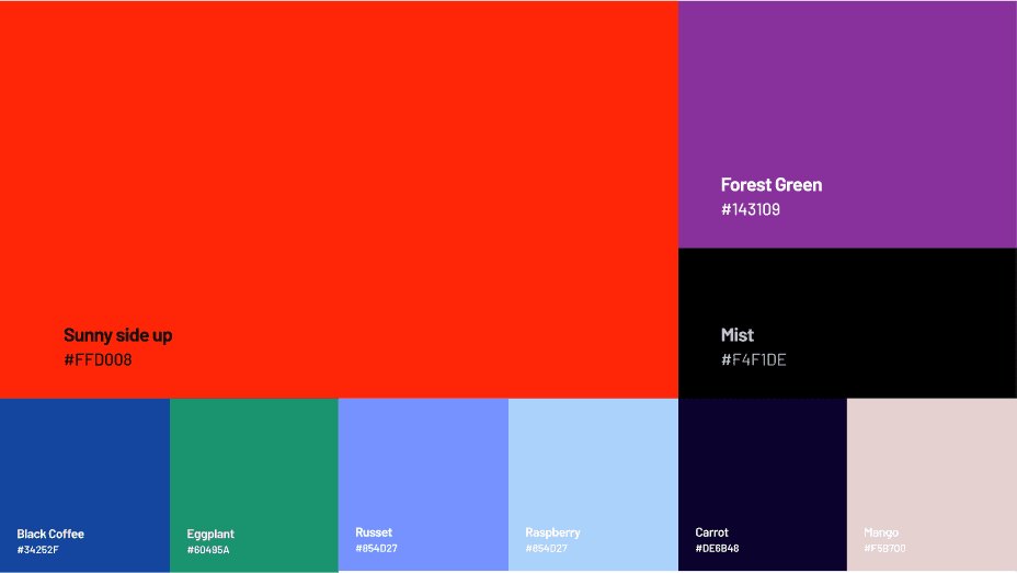
Palette: I kept contrasts purposeful — neutral background to show content clarity and an accent for CTAs that reads like a “trust beacon.”
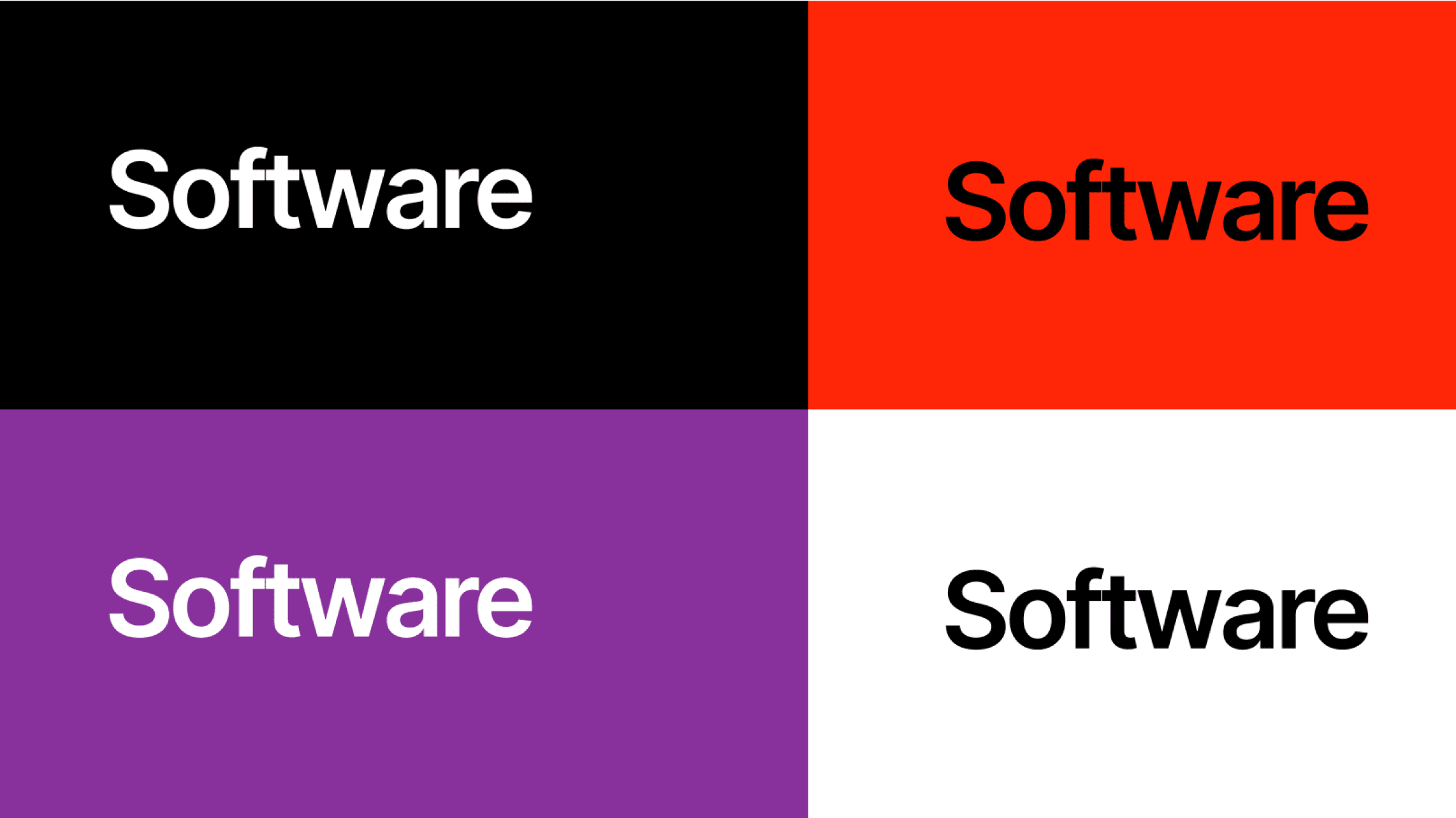
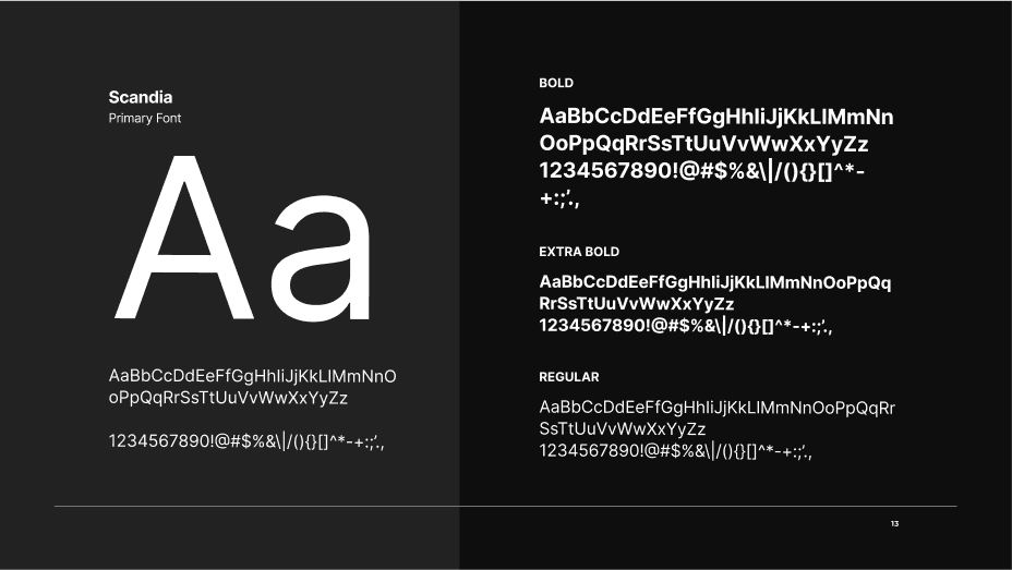
Typography: Clear, technical sans-serif for headings; readable body text for setup instructions — optimized for quick scanning.
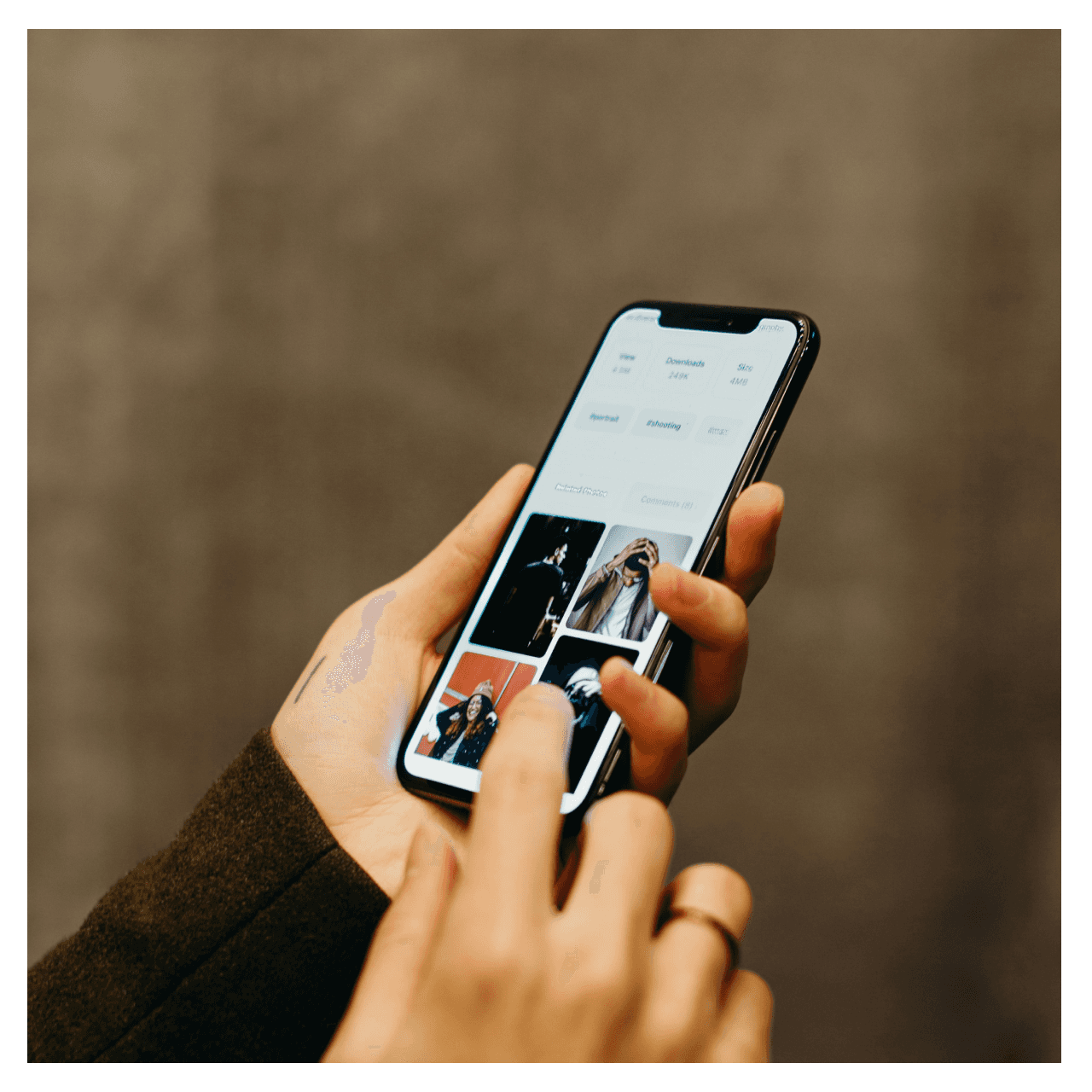
Imagery & Icons: Minimal device mockups, secure-themed icons (locks, shields, device pairs) to reinforce the product domain without heavy illustration.
I treated visual design as defensive equipment — every element should reinforce credibility.
Level 5 — Mechanics (components & interactions)
I built UI like a reusable equipment set:
Buttons & CTA states: Idle → hover → pressed with clear affordances (tap targets optimized for mobile).
Feature cards: Scannable, with a single micro-interaction (hover lift or slight microcopy reveal).
Onboarding flow preview: small walkthrough cards showing step-by-step setup (QR scan, pairing, recovery phrase).
Responsive grid: Screenshots show both desktop and mobile — I replicated those breakpoints and prioritised single-column flows for phones.
Interactions were tuned to be lightweight: subtle motion that signals success (e.g., a checkmark animation) without slowing the player down.
Level 6 — Key Screens
From the gallery on the project page I identified the core screens to design and annotate:
Landing / Hero: One-line value prop plus primary CTA and a tiny device mockup to show the app in action.
Features & Benefits: Short cards listing authentication features — device sync, one-tap login, enterprise SSO readiness.
How It Works / Setup Guide: Step cards with microcopy for scanning, pairing, and fallback options.
Trust Section: Badges or partner lines to reassure enterprise and individual users.
Footer / CTA: Clear contact and install routes — the final boss doorway to conversion.
For each screen I wrote microcopy that reads like mission instructions — short, actionable, and reassuring.
Level 7 — Boss Fights & My Tactics
Boss: Security complexity. Many users are put off by dense technical text.
My tactic: Use progressive disclosure — show the core value up front, let advanced details live behind a “Learn more” toggle or modal.
Boss: Trust skepticism. Users must feel safe to adopt an authenticator.
My tactic: Surface credibility via concise trust badges, concise explanation of privacy policies, and predictable UI patterns that match established security products.
Boss: Onboarding abandonment. Setup steps can be drop-off points.
My tactic: Keep steps atomic, give feedback after each step, and offer recovery/help inline (microcopy + contextual help).
Level 8 — Loot & Results
What I shipped: a stripped, elegant marketing front for an authenticator app — focused copy, device mockups, clear setup/tutorial flow, and a component system ready for extension.
Wins to call out in the portfolio :
Faster understanding of the product (users can read core value in 3–5 seconds).
Cleaner onboarding path that reduces friction during initial setup.
A scalable UI system for future features (enterprise pages, docs, dashboard).
Level 9 — XP & Future Quests
Skills I leveled up: product-led copy for security tools, designing onboarding that reduces cognitive load, and building reusable UI for high-trust domains.
Next quests I’d pick:
Add interactive setup simulation (mini-quest) for visitors to try pairing flow in the browser.
Build a developer portal page with SDK docs and enterprise integration guides.
Run micro-A/B tests on CTA phrasing (“Protect account” vs “Get started”) to tune conversion.